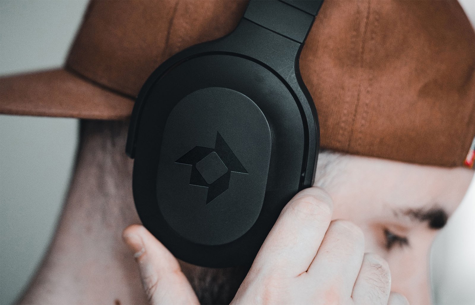
A passion project for a headphone company that creates high-quality, well-designed headphones for young professionals, audiophiles, and music enthusiasts who value good design.
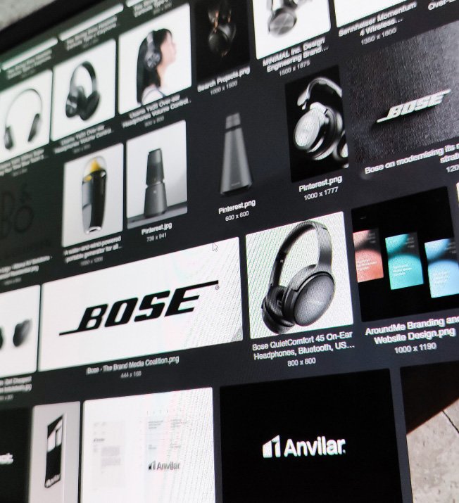
First was collecting details, defining the brand, and doing research on the market and the big competitors out there like Bose, Bang &Olufsen, and Sennheiser.
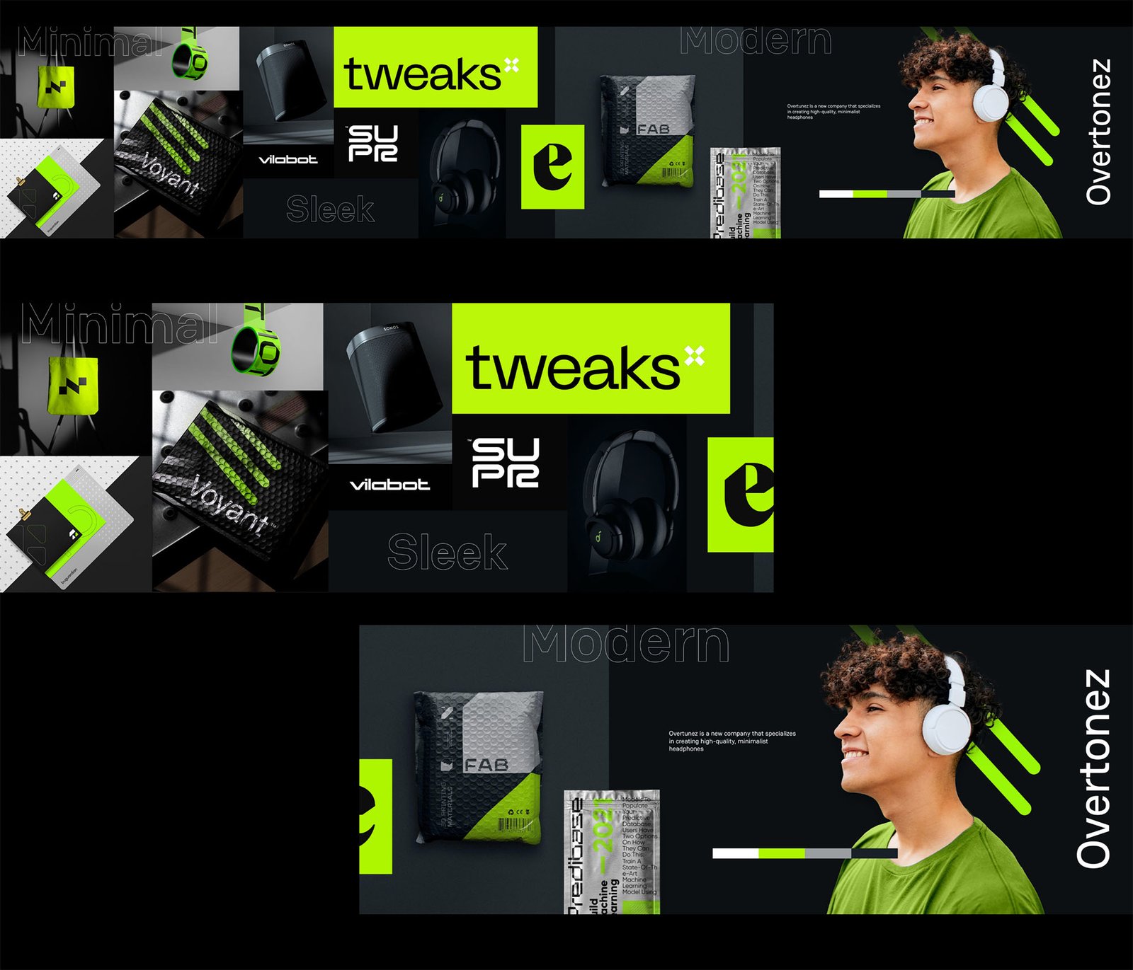
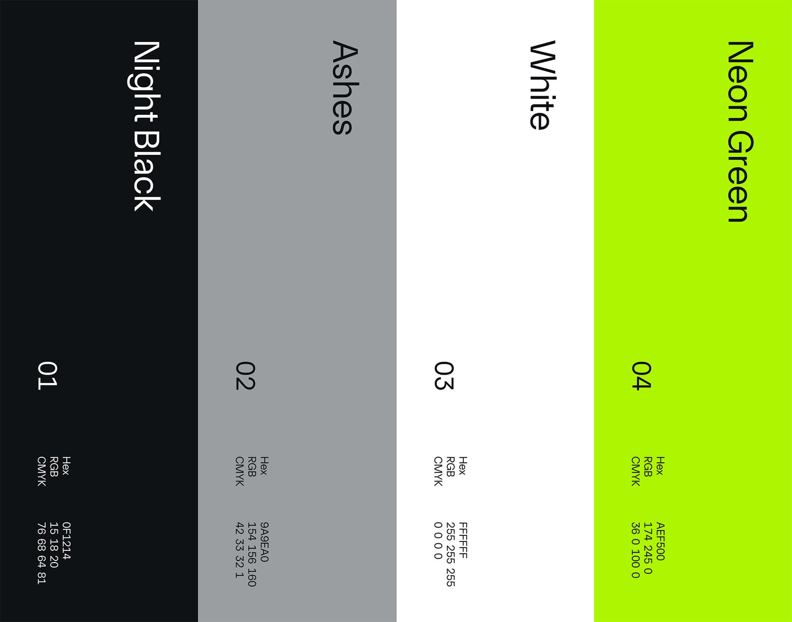
Using the insights we have collected, we built a stylescape to definethe future visual identity of the brand and guide future designs
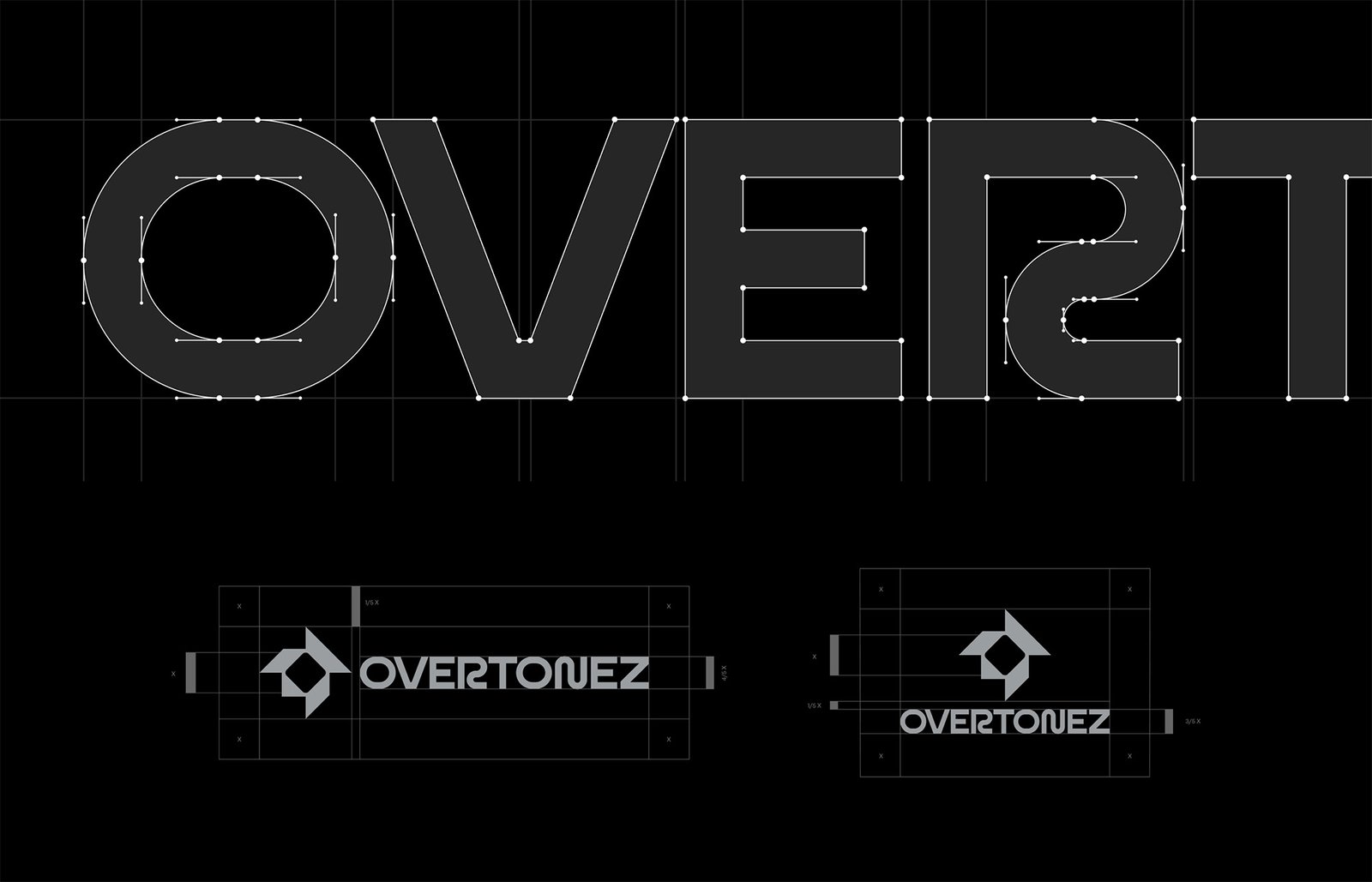
A strong and sleek logo design is vital for a brand like Overtonez that care not only about product quality but also design aesthetics.
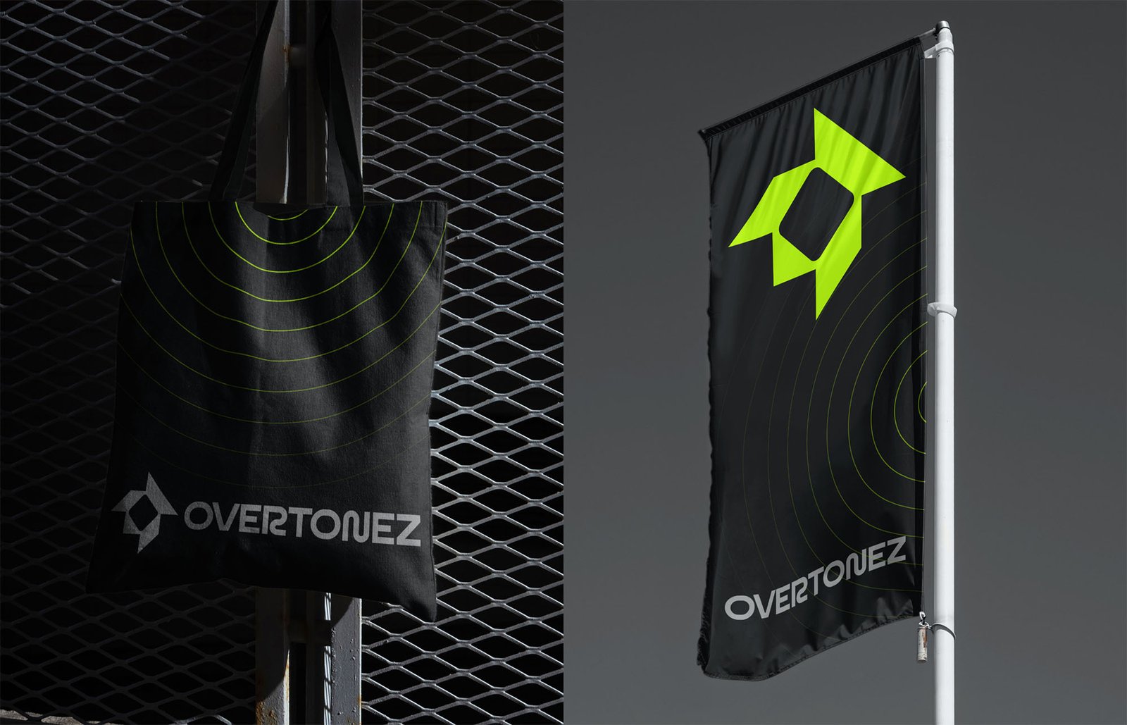
This is why it was important to create an iconic brand mark that will look cool on products.
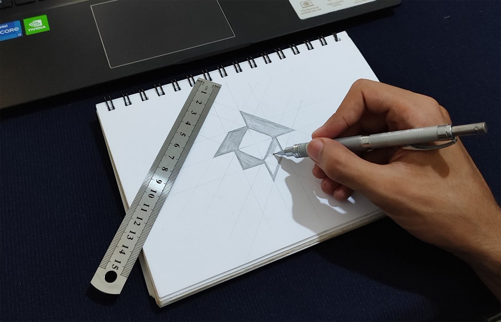
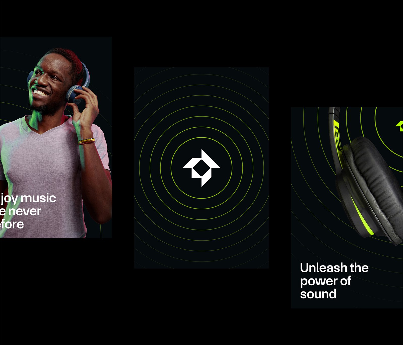
We went through various marks focusing on keywords like simplicity, sound, beat, eco, and the letter O. We came up with some interesting concepts but we finally chose this abstract, strong, and sharp mark.
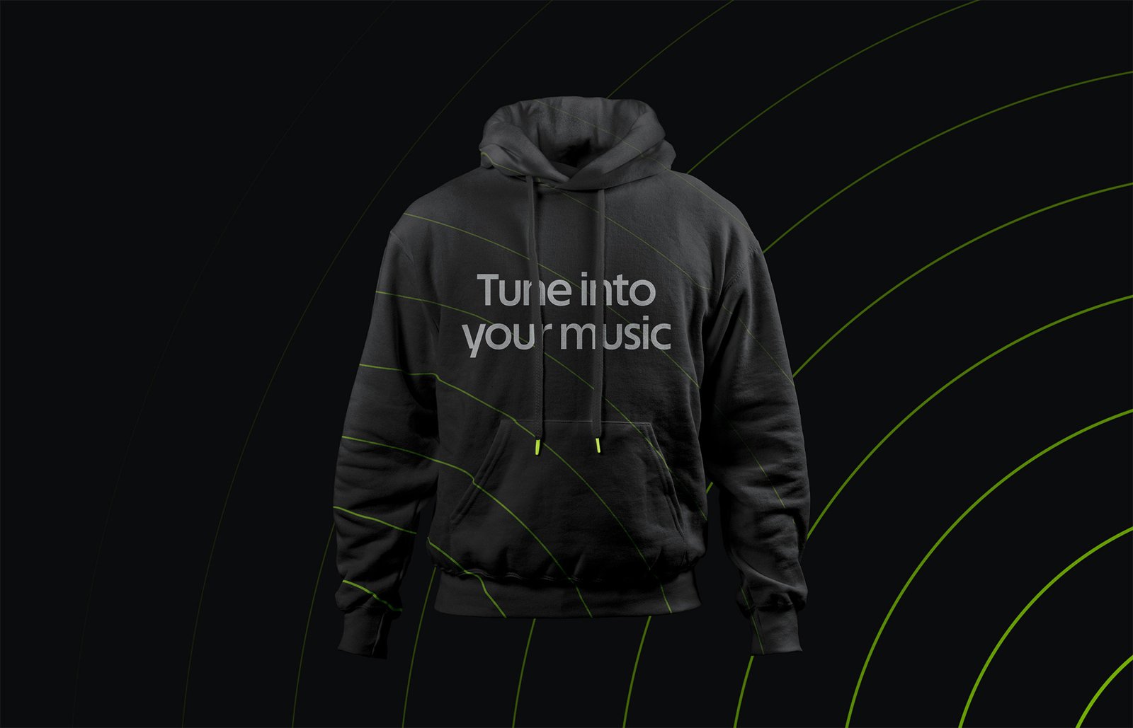
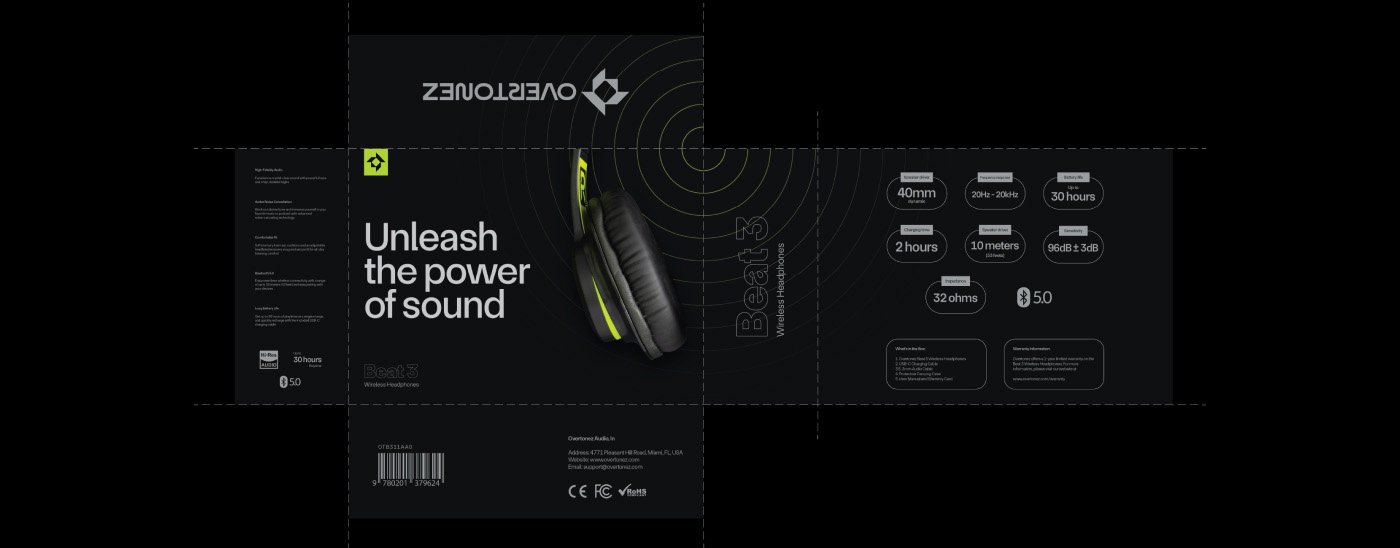
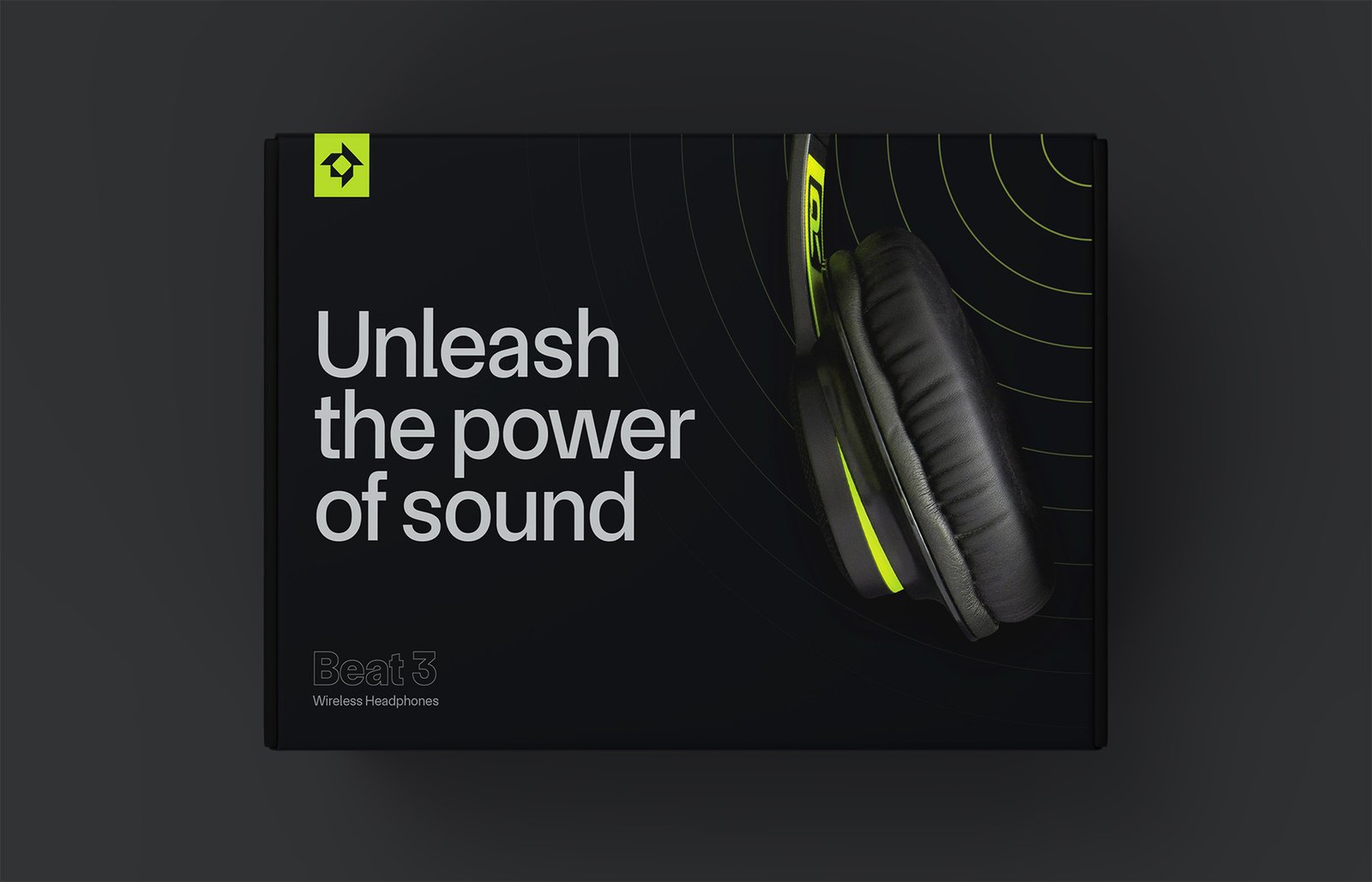
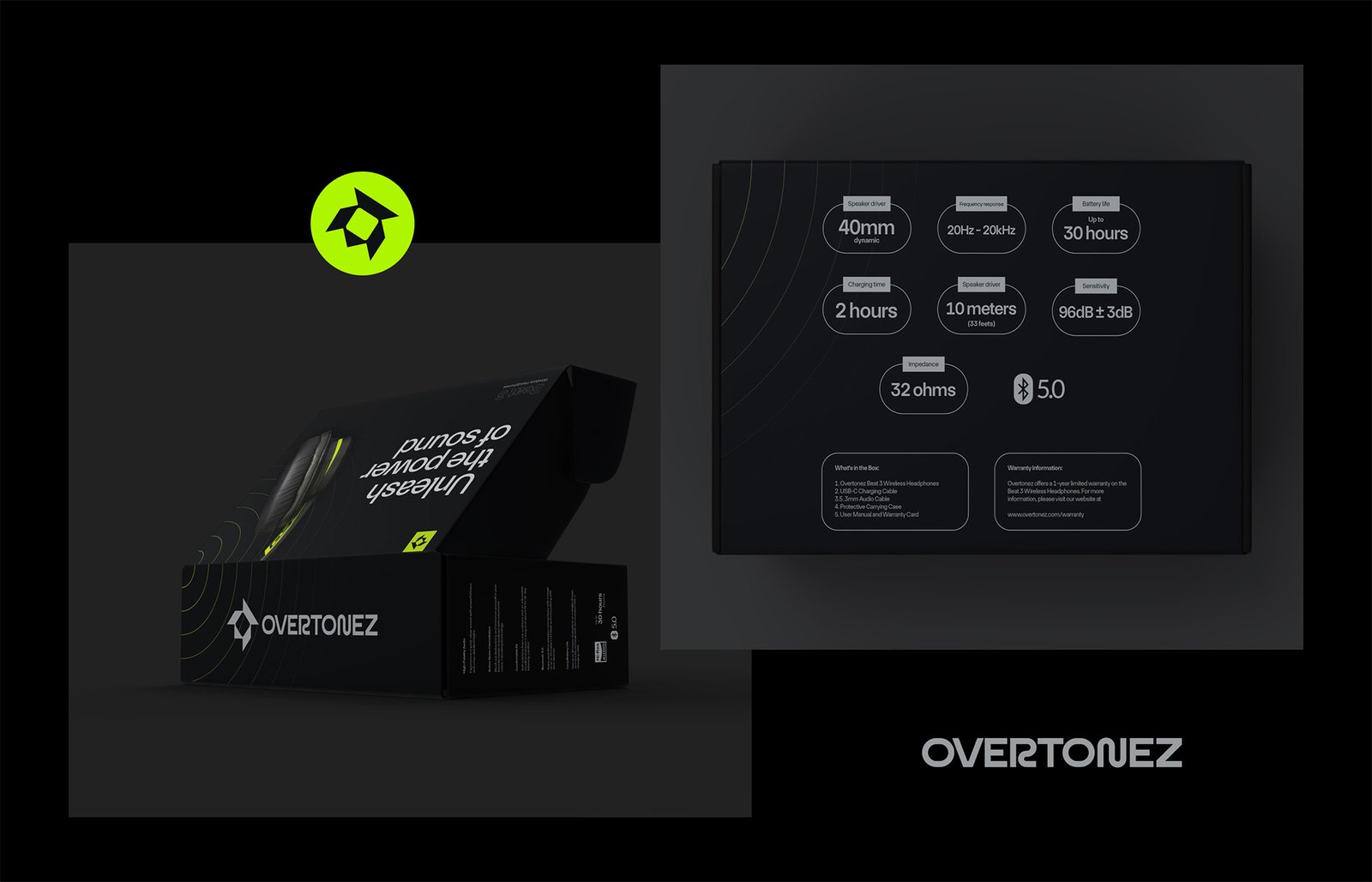
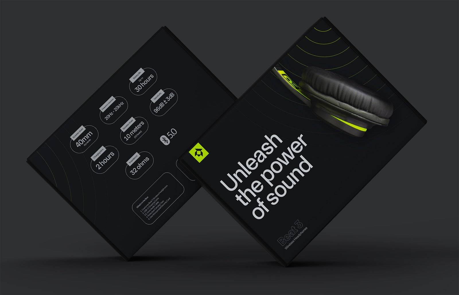
The most interesting element is the packaging, the design looks so sleek and interesting and will work as a selling element for the product. The neon fading circles on the packaging work as a nice element that adds interest to the package and gives a cool beat vibe