Each day, lots of startups get created, and each day there are lots of logos been trademarked.
So you may have a logo designed by you or you made a friend or someone from the family design you a logo. Or you hired a designer and you’re not sure if the logo that you have is good or not.
Before you know what makes a good logo, let’s understand the meaning of a logo and what it is built for.
What a logo really is?
A logo is a symbol that identifies the brand. It makes it identifiable between other similar or different brands.
It’s like a face to a human. People don’t remember names as they remember faces, right? A logo is just the face of a company that helps identify it.
Why businesses need logos?
Businesses around the world ensure that they have a good logo to make them stand out. They need a logo that will be easy to work with and they can use it everywhere.
This logo should reflect their personality, and anyone who sees it should get a sense of what the brand stands for.
So what makes a logo considered as a good logo that could help the business?
3 Main Characters of a good logo
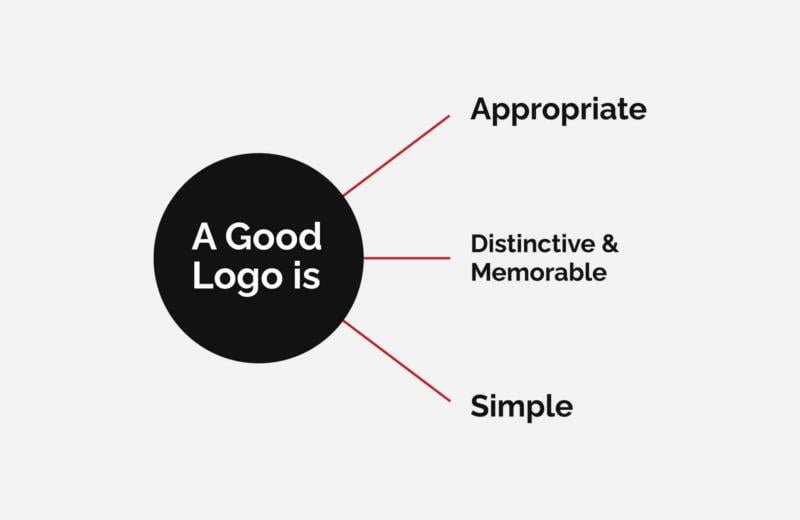
As Sagi Haviv pointed out, a good logo should be:
Appropriate
Hear me when I say this: if you have a restaurant, your logo doesn’t have to feature food or a spoon in it. Logos aren’t made to explain they made to identify.
When a logo is appropriate this means that it should be appropriate in the feeling. For example, if your brand is elegant and luxurious, the logo should reflect that feeling, it should look elegant and luxurious.

Distinctive & Memorable
A logo should be easy to identify, it should look different and unique to that brand.
It should be easy to remember. People should recognize it when they see it the next time.

Simple
A logo shouldn’t say a whole lot. If you provide a lot of products, the logo doesn’t have to feature all those products in it.
Logos are made to be simple and easy to remember. They should work in all applications from huge signage to a very small pin. And in order for logos to work everywhere and be memorable, they must be simple.

So now that you know what logos means and what makes them good, let’s look at some misconceptions people have about logos.
Misconceptions about logos
The logo should be beautiful
A logo isn’t a masterpiece, it doesn’t have to be pretty, it doesn’t have to have a lot of colors and crazy details. It should be simple and easy to understand at first glance, and it should be easy to remember.
The logo should say a lot about us
That right it should be relevant to the company and the customers, but it shouldn’t say a lot.
Logos are made to identify not to explain, they don’t have to have a car or spoon or anything crazy. It shouldn’t also be too simple. A circle is a clean and simple shape but it’s too generic to be a logo.
The logo must be a Symbol
Logos can be anything. They could be illustrated symbols. they could be simple wordmarks or they could even be a very abstract shape that could have no meaning in itself.

Everyone should like the logo
If your friend doesn’t like it that doesn’t mean it is not good. You can take your friends’ and families’ opinions for sure but not because one person doesn’t like it means that it’s bad.
The most important people who should like the logo are your customers. The logo should resonate with your vision and with your customers. If your customers are children then it should appeal to children.
A logo can make or break the business
A logo in itself can’t make a huge difference. There are lots of other things that could play a part in your success. For instance, your package, your marketing strategy, your website, your tone of voice, your business strategy, etc.
A logo should be on-trend.
No, a logo doesn’t have to be on-trend, and even sometimes it shouldn’t.
Logos should be timeless, which means they should still for a long time, or even forever.
You will only have to change it when it becomes no more relevant to the brand.
The logo should look like our competitors’ logos.
It should be relevant to the industry you’re in, but it shouldn’t look the same as your other competitors. The reality is, it should look different, it should stand out when it put beside them.
Final words
If you want to make sure that your logo is good, make sure it’s:
- Appropriate to your business personality.
- 2. Distinctive to your business and easy to remember and distinguish.
- 3. Simple and can be used on any application that it needs to be on.