Words like premium, modern, bold, friendly, or minimal sound fairly specific until two people imagine completely different things.
A client might say they want something minimal and picture a quiet, editorial brand. You might hear the same word and imagine a much more geometric, stripped-back system.
If you move too far into the identity before resolving that difference, you can end up discussing detailed design work when the real disagreement is much earlier: the overall visual direction.
That is where I find Stylescapes useful.
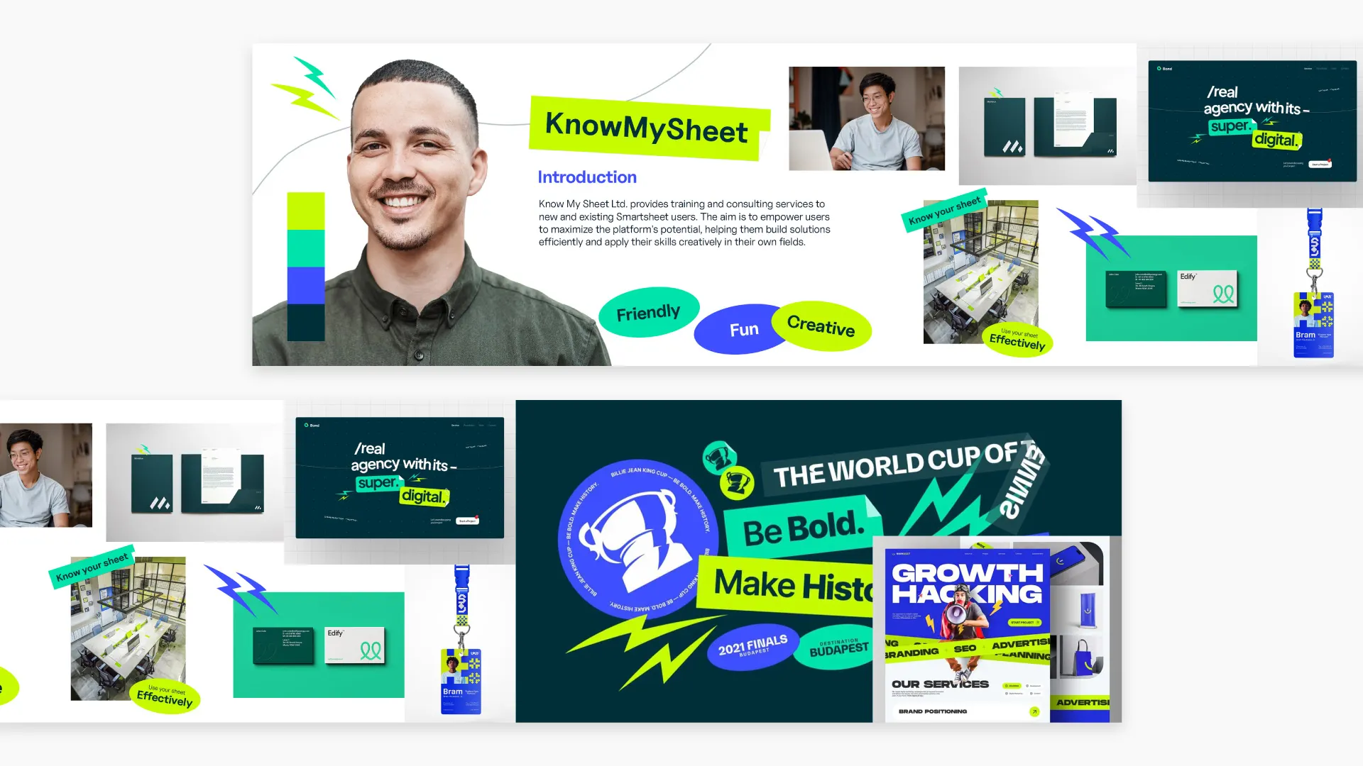
A Stylescape gives the designer and client something visual to react to before the complete identity is developed. Instead of trying to agree on abstract words alone, you can start looking at the type, imagery, color, graphics, textures, applications, and overall feeling together.
What Is a Stylescape?
A Stylescape is a curated visual direction that shows how a potential brand world could look and feel before the complete identity is developed.
It can combine photography, typography, colors, textures, graphic elements, patterns, applications, environments, and other visual references into one intentional composition.
I think of it as sitting somewhere between a rough moodboard and a finished brand guide.
A moodboard can help you explore a feeling. A brand guide documents a visual identity that has already been developed. A Stylescape sits somewhere in the middle. It starts turning that early exploration into a more coherent direction that the designer and client can actually discuss.
The important part is that a Stylescape is not just a collection of nice images.
Its real job is communication and alignment.
You are taking the words, positioning, audience, personality, and other strategic decisions from earlier in the project and starting to answer a more visual question:
What could this brand actually feel like?
Chris Do and Jose Caballer, through Blind and The Futur, helped popularize the Stylescape approach within modern brand identity design and education.
Stylescape vs Moodboard: What’s the Difference?
There is some overlap here, and different designers use the terms differently. I don’t think the distinction needs to be treated as a rigid rule.
For me, the practical difference looks something like this:
| Moodboard | Stylescape |
|---|---|
| Looser exploration | More intentional visual direction |
| Mainly inspiration and references | Starts combining parts of a possible identity |
| Often used early to explore mood | Usually comes after some strategic direction has been established |
| Can contain disconnected visual references | References should begin to work together as one visual world |
| Useful for discussing general feeling | Gives the client something more concrete to evaluate |
A moodboard might tell me, “This brand should feel warm, editorial, and crafted.”
A Stylescape starts asking, “What kind of typography supports that? What kind of photography? What colors? How does the graphic language behave? What might this look like on packaging, a website, signage, or another relevant application?”
That extra level of intention is what makes the format useful to me.
Why Use Stylescapes in a Branding Project?
The biggest reason is simple: they let you have the visual-direction conversation earlier.
Instead of moving straight from strategy into detailed identity design, a Stylescape gives you a point where the designer and client can look at the visual direction together first.
That can help surface uncertainty earlier, make directional approval easier, save time later, and reduce unnecessary revisions.
I would not say a Stylescape eliminates revisions. It doesn’t.
What it can do is help you identify a directional mismatch before you have spent a lot of time developing logos, applications, or a full identity around the wrong visual idea.
I had this happen on the Cash X identity. I thought the client wanted a much more energetic direction, while he had something more modern, convenient, and refined in mind. The Stylescape made that difference obvious before I developed the complete identity, so I could adjust the visual language early.
A few things become easier:
- Abstract words become visual. Instead of debating what “bold” means, you can look at an actual direction.
- The client has something concrete to respond to. Feedback tends to become more useful when there is a visual system in front of them.
- You can establish direction before detailed design. That gives later identity work a clearer reference point.
- Different creative routes can be compared earlier. The conversation is about direction rather than tiny execution details.
- Your presentation becomes easier to explain. You can connect typography, imagery, color, materials, and applications back to one central idea.
This is also where the Stylescape becomes useful for the designer, not only the client. Once a direction is approved, you have a reference you can keep coming back to as the identity develops.
What Should a Stylescape Include?
There is no checklist you have to complete.
The goal is not to fit every possible branding element onto one enormous canvas. The goal is to include enough information to make the visual direction understandable.
Depending on the project, a Stylescape might include anything from typography and photography to environments, packaging, UI, textures, icons, and graphics.
I find it more useful to think about those elements in groups.
Brand and audience context
You might include:
- target-customer imagery
- personality cues
- short pieces of relevant messaging
- environments or lifestyle references
These help give the direction context. You are not just deciding how a brand looks in isolation. You are trying to show who it is for and what kind of world it belongs in.
Visual language
This might include:
- typography
- color
- photography
- textures
- patterns
- illustration
- graphic elements
- icons
These usually do most of the work in defining the character of the direction.
Applications
Depending on the project, you might show:
- packaging
- signage
- stationery
- website or UI
- social content
- environmental graphics
- product or application mockups
Applications can make an abstract direction easier to understand because the client begins seeing how the visual language might behave in context.
You do not need all of these.
A SaaS brand may benefit from interface or digital-product references. A hospitality project might need spaces, signage, menus, or physical materials instead.
Include what helps explain the direction. Leave out what doesn’t.
Stylescape Example: Cash X
One of the most useful things about a Stylescape is that it can reveal a mismatch before you get too deep into the identity.
I had this happen while working on the visual direction for Cash X.
From my conversations with the client, I understood that the brand should feel modern, friendly, and have some energy. He also wanted the identity to represent money, which naturally pushed the color direction toward green.
My first Stylescape took those ideas in a more energetic direction.

I paired the green with a strong purple, used brighter combinations, and introduced more expressive graphic elements. The result still felt modern, but I had pushed the energy much further than the client had in mind.
What he was imagining was more modern, convenient, and refined.
That difference became much easier to see once we had an actual visual direction in front of us.
So I adjusted the Stylescape.

I kept green as an important part of the identity, but toned down the overall visual language. I introduced black, used more white space, simplified some of the graphic elements, and made the compositions feel more controlled.
The second direction still feels contemporary, but it has more of the elegance and convenience the client was looking for.
This is a good example of what I actually want a Stylescape to do.
The first direction wasn’t wasted work. It helped us understand that we were interpreting the same words differently.
And we found that out before developing the complete identity around the wrong direction.
What to look at in these two Stylescapes
When comparing them, don’t just look at the individual references.
Look at how the whole visual language changes:
- Color: bright green and purple become a more restrained green, black, and neutral palette.
- Graphic language: expressive elements become simpler and more controlled.
- Composition: the revised direction gives elements more room to breathe.
- Overall feeling: the emphasis moves from energetic and expressive toward modern, convenient, and refined.
That is really the value of showing a Stylescape as a complete visual world. A color or typeface might seem right on its own, but you only start to understand the direction properly when the pieces are working together.
How Many Stylescapes Should You Create?
I usually try not to present more than three directions in a project. Once you start presenting too many possibilities, the decision itself can become harder.
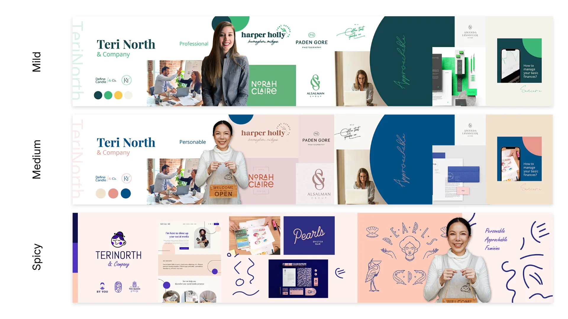
One framework I use is Mild, Medium, and Spicy:
Mild:
Closest to what the client is probably expecting. It stays relatively near the established brief or category.
Medium:
Pushes the direction a little further. It introduces something less expected while still feeling reasonably familiar.
Spicy:
The more unexpected route. This is where you can test a direction that feels more expressive, unfamiliar, or challenging.
I would treat this as a framework rather than a rule.
Some projects might only need two genuinely strong directions. Others may require a different approach entirely.
What matters more is that every direction has a reason to exist. If two boards are basically identical except for the color palette, you probably do not have two meaningful creative directions.
What Size Should a Stylescape Be?
There is no universal required Stylescape size or set of Stylescape dimensions.
The format can vary depending on how the designer wants to build and present the direction.
For my own Stylescape templates, I use:
5760 x 1080 px
That is effectively three 1920 x 1080 horizontal screens placed side by side.
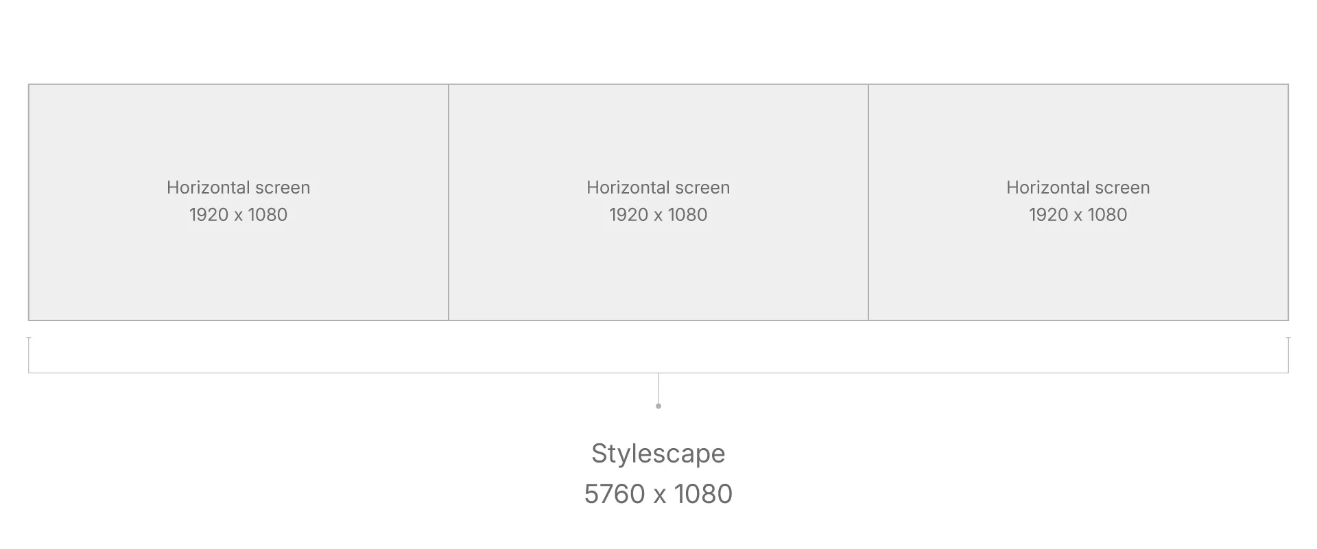
I like this format for digital presentation because it gives me plenty of horizontal space to build a visual narrative while still breaking naturally into screen-sized sections.
It also works well when presenting remotely over Zoom, Google Meet, or another screen-sharing tool. You can move through the Stylescape in sections instead of trying to squeeze the entire board onto one screen.
The important distinction is this:
5760 x 1080 is the size I use for my templates. It is not an industry-standard Stylescape size.
If a different canvas works better for how you present your work, use it.
The format should support the presentation, not become a rule you follow for its own sake.
How to Create a Stylescape Step by Step
There are plenty of ways to build the actual file. For me, the more important part is the thinking before the software.
1. Start with the strategic foundation
Before collecting images, understand what the brand is trying to communicate.
Look at the positioning, audience, personality, competitive context, and anything else that should influence the visual identity.
Without that foundation, it is very easy to create something attractive that has little connection to the actual project.
2. Define the purpose of each direction
If you are exploring multiple directions, decide what makes each one meaningfully different.
Do not start with three empty canvases and hope they somehow become Mild, Medium, and Spicy.
Give each one an idea.
What should this route communicate that the others do not?
3. Research the visual territory
Start collecting relevant imagery, typography, colors, materials, environments, graphic references, applications, and other visual cues.
At this stage, exploration can be fairly wide.
You are trying to understand what the direction might contain before narrowing it down.
4. Curate aggressively
This is where a lot of the work happens.
A Stylescape should not just be a Pinterest board stretched horizontally.
Not every image you like belongs in the final composition. Remove references that repeat the same idea, contradict the direction, or are only there because they look good.
The board gets stronger when the remaining elements all have a job.
5. Build one coherent visual world
Start composing the selected references together.
Think about hierarchy, scale, rhythm, color relationships, typography, imagery, and how the eye moves through the board.
The references should begin feeling like parts of the same possible brand rather than unrelated images sitting beside one another.
6. Check the direction against the brief
Step away from the board and ask whether it actually communicates what you intended.
If the direction was meant to feel approachable and playful, does it?
If it was meant to feel sophisticated and quiet, are there elements fighting against that?
This is more useful than asking only whether the composition looks nice.
7. Present the thinking, not only the board
When you show the Stylescape to the client, explain why the elements are there.
Connect the typography, image direction, color, graphics, and applications back to what you are trying to communicate.
The client should understand the idea behind the direction, not be left to decode a large collage on their own.
8. Get directional alignment before going deeper
The purpose of the presentation is to establish enough agreement to move confidently into the next part of the identity.
That does not always mean the client selects one board completely unchanged. Sometimes a direction needs refining.
What matters is that you leave the Stylescape stage with a clearer shared understanding of where the identity should go.
Want to Create Your Own Stylescape?
I’ve taken two layouts from my full Stylescape Templates Bundle and made them available for free.
They’re fully editable in:
- Adobe Illustrator
- Adobe Photoshop
- Adobe InDesign
If you want to try this process in your next branding project without building the entire layout from scratch, they give you a useful place to start.
Do You Need a Stylescape Template?
No. You can absolutely create a Stylescape from scratch.
A template should not decide the creative direction for you.
You are still responsible for the strategy, research, imagery, typography, color, visual thinking, curation, and the rationale behind what you present.
What a template can give you is a practical structure: grids, organized files, placeholders, and a faster starting point.
That leaves more of your time for the part that actually matters: deciding what the direction should communicate.
If you want more layout options, the complete 23 Stylescape Templates Bundle includes editable files for Illustrator, Photoshop, and InDesign.